Food & Beverage · Branding · Packaging
Packaging that sells the platter before the lid comes off.
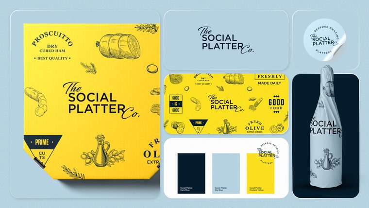
How we gave The Social Platter Co a complete brand identity and packaging system, so every box looks as good as what's inside it.
Scope of project
- Brand identity and branding
- Logo design as part of the identity system
- Brand colour and pattern system
- Packaging design for grazing platters
The challenge
Grazing platters are bought with the eyes. They’re gifts, party centrepieces and photo opportunities, and the box is the first thing anyone sees. Plenty of platter businesses pour the effort into the food and then hand it over in a plain box with a sticker on top.
The Social Platter Co needed a brand that matched the generosity of the product and packaging that turned every delivery into an advert.
The process
Discovery
We started with how the platters are actually bought and used: who orders, for what occasions, and where the box ends up (on a table, on Instagram, on someone's doorstep).
Market look
We looked at how other platter and gifting brands present themselves, to find the visual clichés to avoid.
Identity design
We designed the logo and identity together, so the mark was always part of a wider system rather than a standalone badge. More on our branding work across North Wales.
Colour and pattern system
We built a colour and pattern system that could wrap a box, fill a social post or sit behind a menu without ever feeling repetitive.
Packaging design
We applied the system to the platter packaging, designed to be photographed and shared.
The thinking behind the final direction
The box is the billboard.
A platter is shared, posted and passed round. Packaging that people want to photograph does the marketing for free, so the pattern and colour were built to look good on a phone screen as much as on a table.
Pattern over clutter.
A repeating pattern gives the brand presence without shouting a logo across every surface. The same pattern runs from the box to the feed, so the brand is recognisable before anyone reads the name.
One system, every surface.
Logo, colour and pattern were designed together, so packaging, social and print all read as one brand.
The outcome
A complete identity and packaging system that gives The Social Platter Co a consistent look from the first social post to the box on the doorstep.
Services on this project

Want packaging that sells itself?
Send me your brand or website and I'll record you a free personal video review. Around 10 minutes, just for you: what's working, what's costing you clients and what I'd fix first. No pitch deck, no hard sell.
I only do 5 a month, because I do every one myself.
Get my free video review